


LinkedIn Ads benchmarks for 2023
Not all of your website visitors will navigate to your website’s resources page – and if you want to increase your website’s conversion ratio, those visitors will need a little nudge in the right direction.
HubSpot calls-to-action (CTAs) on your website are the first step towards directing your visitors to a landing page, and it’s important that these CTAs show your visitors the right content at the right time to maximise conversion rates.
But even if you have relevant CTAs, where should you include them on your website? In this blog, I’ll share some top tips on HubSpot call-to-action placement across your website to ensure that you are nurturing your contacts with the right content at the right time.
A great way of breaking up the text on your homepage is to use banner CTAs so that your best, top of the funnel pieces of content is front and centre and have a bold CTA encouraging website visitors to click. This can be a particularly powerful driver to landing pages if the CTA fits naturally and can follow on from the page copy.
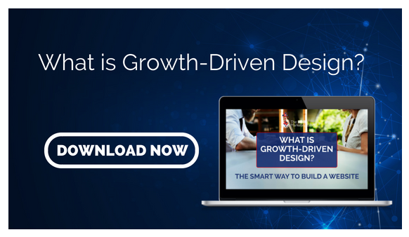
Check out this really cool example from HubSpot!

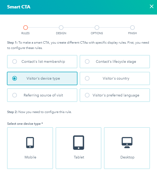
If a visitor has submitted a form on your website previously, then you need to get some smart CTAs on your website!
HubSpot’s smart CTAs enable you to add another layer of personalisation to your website which can be based on:
The device a contact is using (i.e. mobile, desktop, tablet)
The country they are in
Their preferred language
The source that led them to your website
HubSpot active list membership
Their lifecycle stage
For example, if a contact has filled out a form for a top of the funnel eBook, when they visit your homepage again, you can show them a different CTA which links to a different piece of top or middle of the funnel content. Please see the examples below.
On the first visit prior to filling out a form:
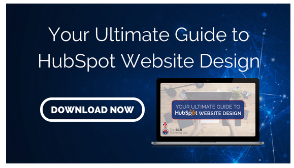
On the second visit after filling in a form:
Alternatively, if a contact is viewing your website on a mobile device, you can ensure that you’re showing them a smaller CTA that is proportionate to the size of the screen they’re viewing it on. You can optimise your CTAs for mobile devices by clicking the following rule (Visitor's device type) when creating a smart CTA.
In another scenario, if your contact has become a marketing qualified lead, you can start showing them content CTAs that will help to move them further down the funnel, such as case studies, middle and bottom of the funnel eBooks or whitepapers.
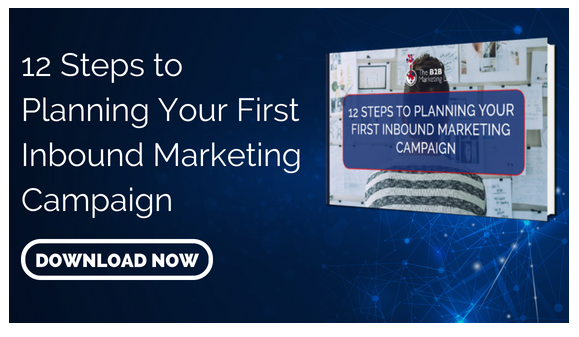
Before becoming a marketing qualified lead:
After becoming a marketing qualified lead:

While it may be tempting to add demo CTAs to your homepage, stop and think about the impression it gives visitors, particularly brand-new visitors to your website.
Although booking demos are the holy grail of conversions, people are unlikely to sign up for them if they are being bombarded with ‘Book a demo’ CTAs as soon as they land on the website.
Instead, having a demo CTA as part of the website navigation menu means that your contacts can access it when it suits them and it’s always visible. Also, if you are using lead nurturing, another method is to include a short P.S. at the end of an email to promote a demo in a more passive way.
On your product and service pages, the copy is more specific to your offering and can be tailored toward certain buyer personas. Here, a mix of sidebar and banner CTAs are again useful to break up copy and target prospects with content that is focused on their specific problems and how you help them solve them.
Alternatively, text-based CTAs can be added at this point and included naturally within the page copy without blocking up the page with banners and graphics.
You can also optimise your thank you pages with CTAs that link to the next piece of content in the funnel. Using smart CTAs here too can eliminate the risk of promoting a piece of content to a contact who has downloaded it before.
Again, adding CTA areas to your follow-up emails allows you to keep up the engagement with your leads by encouraging them to download more content.
You can also amend your thank you page and in-email CTAs to include smart content that segments by buyer persona and targets their specific pain points.
So there you have it, the top ways that you can optimise your website with effective, impactful CTAs that ensure that you present your contacts with the right content at the right time.
.png)
The international support you need, whenever you need it.